

MC Electrical & Construction
MC Electrical & Construction is an affordable resource for consumers, while maintaining reliable service, no matter the time. The brand identity developed is intended to reflect the values and various services of MC Electrical & Construction, and will help the owner reach his business goals by creating an industry-leading identity that will place him first in consumers minds, and spread awareness on the additional services that the business offers.
01
New Logo
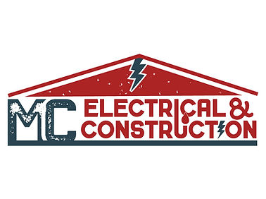
The client was branching out into various industries and needed a strategy-backed logo that encompassed their variety of services. The new logo developed has subtle traits that directly relate to each of the services offered. The development of the brand identity revolved around the representation of quality, hard work, and the services they offer.

02
Logo Variations
Emphasis on the MC was added to make the naming recognizable and memorable. The house structure further emphasizes the range of services that the client offers. The "I" in Electrical was extended into the "U" of Construction to form a drain pipe, with a water drop added to represent the plumbing service, the "I" in construction was replaced with a lightning bolt to represent the electrical services, and the straight line at the bottom represents the dirt and concrete work the business offers.
03
Color
The colors of the business needed to accurately represent the brand values and mission.The values of the business included quality, hard work, kindness, and integrity. The colors were chosen from lifestyle imagery and adjusted to better represent the meaning behind the businesses values. The colors offer a rich, bold aesthetic to the brand identity.


04
Typography
The typography chosen for this brand is bold, easy to read, and provides emphasis where needed. The typography matches the overall style of the brand identity, further creating cohesion in the business.
05
Pattern
The pattern created for MC Electrical & Construction consists of illustrated vectors focused on the various services that the business offers. The line width of the pattern elements matches with the style of the logo, creating cohesion throughout the branding.


