
Sunshine Lane Meats and More, LLC

Sunshine Lane Meats and More, LLC is a premium meat shop offering butchering and catering services. They needed a brand that represented their premium offerings, setting them apart from other local butcher shops and appealing to a broader audience for their catering business.
01
New Logo
The brand identity developed intentionally appeals to both a masculine and a feminine target audience in order to attract an unexpected industry target market. The logo includes customized type to include meat marbling within the main text, rotated letters to abstractly represent direction and leading down a lane, and altogether represents the brands values of pride, quality, and service.


02
Logo Variations
A brand identity is not complete without logo variations. The primary logo, secondary logo, and submark all provide a variety of ways to effectively use the new brand identity across all marketing collateral.
03
Color
The colors for the new brand identity were chosen for their premium, bold characteristics, matching with the brand strategy developed through initial client onboarding and research. The bold red matched with the bright yellow creates an even bolder brand, enhancing the brand value of being quality and having pride in the business products. The combination of bright and bold colors creates inclusivity in the branding, appealing to both the masculine market and a touch of the feminine market, which enhances the customer experience.


04
Typography
The type chosen for the brand provides a masculine touch while remaining legible, modern and inclusive. The type provides consistency throughout all mediums and enhances the brands tone of voice and style. The slanted type appeals to a feminine market and breaks industry standards.
05
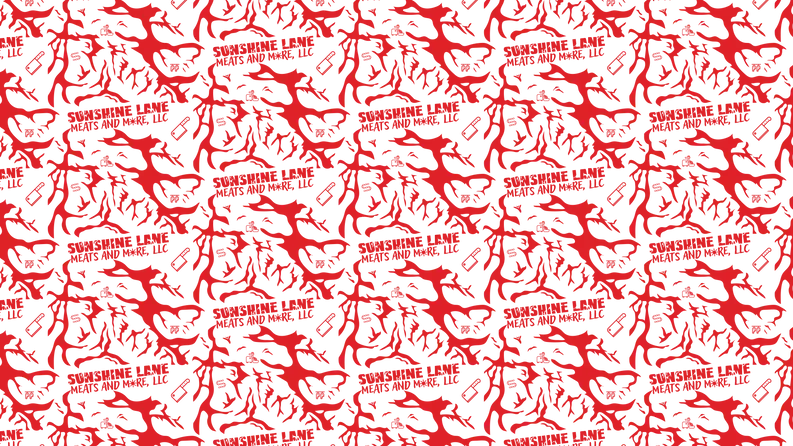
Pattern
The pattern compliments the logo style by utilizing the same meat pattern as used in the custom lettering. The pattern adds a lot of contrast to the brand, and the pattern tells a story aligned with the businesses mission of quality products and services, creating a premium look and feel. There are hidden icons within the pattern that further align with the businesses mission. The illustrations help in quickly identifying that this is a brand focused on quality meats.


